How to Vectorize a Logo: PNG to a Multi-Color SVG, Free
The full technique, not just a file swap: which preset to pick, how many colors to keep, what a layered SVG buys you, and how to check the result. Free, no signup.
What Vectorizing a Logo Actually Means
Vectorizing a logo means rebuilding it as geometric shapes - paths, not pixels - so it stays crisp from a 16-pixel favicon to a storefront sign. Done right, the SVG keeps every color of the original as its own editable layer. If your logo file is ready, the free online logo converterdoes it in under a minute; the rest of this guide is about getting a result you can actually hand to a printer, a developer or a cutting machine.
Two neighboring guides keep this one focused: converting any kind of raster is covered in the guide to converting any image to SVG, and recovering a small, blurry or pixelated logo has its own recovery workflow linked further down. Here we deal with the logo-specific craft: color counts, layered output and quality control.
One warning before anything else: some "converters" hand you an .svg that is really your PNG wrapped in a base64 <image> tag. Open the file in a text editor - if you see one giant encoded blob instead of <path> elements, you got a renamed bitmap, not a vector.
Real results from the converter


Three Kinds of Logo Walk Through the Door
The preset you pick depends on which of three logos you are holding. Decide this first; it is the single biggest quality lever you have.
The one-color mark
Wordmark, icon, stamp - a single color on a plain background. This is the easiest case: the Black & White preset produces one clean shape, the smallest possible file, and exactly what engravers, vinyl cutters and stencils want.
The flat multi-color logo
Two to six solid colors, no gradients - the most common client logo. The Poster preset is built for it: each color region becomes its own vector path, stacked in layers. This is the case most generic guides get wrong by flattening everything to black and white.
The gradient-heavy emblem
Metallic sheens, soft shadows, 3D effects. Tracing can only approximate gradients as stacked color bands. The Photo preset does the best job of it, but expect a stylized poster version of your emblem, not a twin - and a much heavier file.
Which Preset for Which Logo
Match your logo to a row, take the preset - the whole decision in one table:
| Your logo | Preset | What you get |
|---|---|---|
| One-color wordmark, icon or stamp | Black & White | One clean shape, smallest file, cutter-ready |
| 2-6 flat colors (most client logos) | Poster | One editable path per color |
| Gradients, metallics, soft shadows | Photo | Gradients approximated as color bands |
| Logo on a busy or colored background | Prep first | Crop or cut out the background, then trace |
| Tiny screenshot, under ~200 px wide | Get a bigger file | No preset invents resolution - see the blurry-logo guide |
| Logo with hairline serifs or fine detail | Poster + detail up | Higher path detail keeps thin strokes alive |
Curious what happens to the pixels underneath any of these choices? The mechanics are unpacked in what vectorization actually does.
How Many Colors Should the SVG Keep?
This is the decision generic tutorials skip - and it decides both the fidelity and the weight of your file. Every extra color adds paths; the skill is stopping at the number of colors the logo actually owns:
- 1-2 colors: Black & White. If the brand is one color plus its background, tracing in color just pays for anti-aliasing noise. One shape, feather-light file.
- 3-8 flat colors: Poster. The sweet spot for real logos. Brand colors survive as named layers you can recolor; the JPEG fuzz between shapes is absorbed, not traced.
- Dozens of shades: Photo. Only for gradient emblems. Fidelity rises, but so does file size - a traced Photo SVG can weigh ten times its Poster sibling and still look stylized.
Rule of thumb: count the colors in the brand guidelines, add one for the background, and stop there. If you cannot name a color's purpose, the tracer should not draw it.
Layered SVG: Why One Path per Color Matters
Open a well-traced logo SVG in a text editor and you will find a small stack of <path> elements - one per color, largest first. That structure is not an implementation detail; it is what makes the file a working asset instead of a picture of one.
Because each color is its own path, a rebrand is a two-minute edit: select the layer, apply the new fill, export - in Inkscape, Illustrator or any editor that opens SVG. On the web, pointing a layer's fill at currentColor lets the logo follow the page theme automatically. A flattened trace offers none of this; every recolor means tracing again from scratch.
How to Vectorize a Logo for Free (4 Steps)
No account, no install, no watermark:
- Upload the logo - drag and drop the PNG, JPG, WebP or BMP. The largest, cleanest version you have traces best.
- Pick the preset using the table above - Black & White for one-color marks, Poster for flat multi-color logos, Photo for gradient emblems.
- Set the color count to the brand palette - roughly the number of colors the logo was designed with, plus the background.
- Check the preview against the checklist below, then download the SVG - real <path> elements, ready for print, web or cutters.
Under the hood the conversion runs an auto-tracing engine derived from VTracer, the open-source Rust tracer. Your logo is rebuilt as stacked vector shapes - never wrapped or renamed.
Is the Trace Good? A 60-Second Quality Check
Before you ship the file, run it through four checks. Together they take about a minute and catch every common failure:
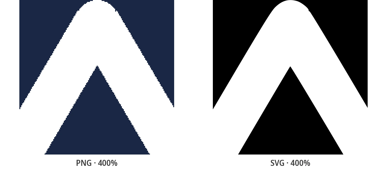
- Zoom to 400%. Edges should stay smooth curves. Staircases or fuzz mean the source was too small or the color count too high.
- Shrink to favicon size. If the mark is unreadable at 16 px, the trace is faithful but the logo needs a simplified icon variant - trace just the symbol part separately.
- Check the colors. Each brand color should read as itself. Off tones mean the tracer spent colors on anti-aliasing - lower the count and retrace.
- Weigh the file. A logo SVG should be a few KB. Tens of KB means the tracer drew noise; that weight will follow the file onto every page that loads it.
The favicon test is the one people skip and regret: a vector that only works at full size protects nothing that a high-resolution PNG would not already do.
When Tracing a Logo Won't Work - and What to Do Instead
Three situations send people to this guide when a tracer is honestly the wrong tool:
- Gradient-heavy emblems. Tracing approximates gradients as bands. If the sheen is the brand, ask the client for the original vector or keep the raster - a banded SVG can look worse than a crisp PNG.
- The only file is a 150-pixel screenshot. No preset invents pixels, but upscaling is not the only route: the recovery workflow in the guide to fixing a blurry logo squeezes far more out of small files than a straight trace.
- It is actually a photo with text on it. Photos need different presets and different expectations - the photo to SVG guide covers that territory.
The dividing line: tracing converts clean shapes into cleaner shapes. When there are no clean shapes in the source, the fix is a better source or a redraw - not more settings.
Illustrator vs Inkscape vs a Free Online Converter
All three roads lead to an SVG. They differ in cost, learning curve and what you can fix afterwards:
| Tool | Best for | Watch out for |
|---|---|---|
| Adobe Illustrator | Full manual control: redrawing paths by hand, exact brand colors, print-shop handoff | A subscription for what is, most of the time, one Image Trace click |
| Inkscape (free) | Local tracing, path editing and cleanup with zero software cost | The learning curve of a full desktop editor; multi-color traces need the multi-scan tab |
| Online converter | One logo, one minute, no install - color presets tuned for logos, layered output | Batch jobs and heavy cleanup still belong on the desktop; check the privacy policy for confidential marks |
An honest note: Illustrator's Image Trace and Inkscape's Trace Bitmap run the same kind of engine an online tracer does. Paying for software buys you manual editing after the trace - it does not buy a better automatic trace.
One Logo, Every Variant - and a Batch Route
Real brand work is never one file. The same conversion covers the whole set:
- Variants: icon-only, horizontal lockup, inverted for dark backgrounds - trace each from its raster source, same preset, consistent results.
- Destinations: print (business cards to signage), web (favicon to hero), and cutters or engravers that follow vector paths directly.
- Handoff: a layered SVG with one path per color is the file developers and printers ask for - no "can you send a bigger version" emails.
Converting a whole identity kit in one pass - every variant, every historical logo - is exactly what the batch conversion guide automates with the free desktop app.
Related Conversion Guides
Recovery, theory and batch work - the guides around this one.
Frequently Asked Questions
How do I vectorize a logo for free?
Upload the logo file to the free online converter, pick the preset that matches it (Black & White for one-color marks, Poster for flat multi-color logos, Photo for gradient emblems), set the color count to the brand palette and download the SVG. No account, no watermark; the free desktop app does the same locally for offline work.
Can I vectorize a logo without Adobe Illustrator?
Yes. Illustrator's Image Trace runs the same kind of auto-tracing engine free tools use - the subscription buys manual path editing, not a better automatic trace. For a one-off conversion, a free online converter or Inkscape produces an equally valid SVG.
Will a multi-color logo keep its colors in the SVG?
With the Poster preset, yes: each color region becomes its own vector path, so the traced SVG keeps the palette as editable layers you can recolor in any editor. Avoid the Black & White preset for color logos - it flattens everything to one shape.
Does the SVG have a transparent background?
The trace reproduces the shapes in your file - if the source PNG has a transparent background, the SVG keeps it; if the logo sits on a solid background, that background is traced as a shape too. For a clean cutout, remove the background before uploading, or delete the background layer in any SVG editor afterwards.
Is it safe to upload a confidential client logo?
The online converter processes the image and discards it - nothing is stored. For logos under NDA or strict brand guidelines, the open-source desktop app runs the same conversion entirely on your machine, offline.
Vectorize Your Logo Now - Free, No Signup
Upload the PNG or JPG, pick a preset, download a layered multi-color SVG in under a minute - no account, no watermark, no Illustrator.
Support Open Source Development
PixelToPath is free to use. If this tool helped you save time, consider buying me a coffee.
❤️ Donate on Ko-fi